
Defining Clean Dark UI: Core Principles and Aesthetic Foundations


A Clean Dark UI eliminates visual noise to help users focus entirely on content, whether reading documentation, analyzing complex data dashboards, or navigating immersive game menus. Standard dark modes often make the mistake of using pure pitch-black backgrounds (#000000) paired with blinding, pure white text (#FFFFFF). This extreme contrast creates uncomfortable visual halation—a glowing haze around high-contrast typography—and significantly increases eye fatigue during prolonged visual tasks.

Instead of absolute black, clean dark interfaces utilize dark charcoal, slate, and muted zinc surfaces. A zero-hue grayscale approach—such as the one detailed in the Clean Slate theme guide—relies on stepped grays like oklch(1 0 0) down to deep, neutral charcoals. Removing hue saturation from background layers prevents unwanted tinting under different display color profiles and prevents visual artifacts on high-brightness panels.
Creating a distraction-free, content-first interface requires applying color with strict intent and structured visual logic:
- Backgrounds: Use layered charcoal tones to establish depth and spatial hierarchy instead of relying on heavy drop shadows or distracting bright borders.
- Text: Apply off-white or light gray tokens to lower stark contrast while preserving full legibility across standard and high-density displays.
- Accents: Reserve vibrant colors strictly for interactive feedback, active state highlights, primary action buttons, and semantic alerts.
Contrast Ratios and OKLCH Color Space Integration
Achieving comfortable readability in dark themes requires careful luminance control and structured color scaling. Using modern color models like OKLCH provides perceptual uniformity across the full lightness spectrum. Unlike standard RGB or HSL color spaces, OKLCH ensures that stepping lightness levels results in predictable, uniform brightness changes across all visual channels without unintended hue shifts.
To maintain WCAG 2.2 AA accessibility standards, text and interactive elements must satisfy specific contrast thresholds against dark background surfaces:
- Standard Body Copy: Minimum contrast ratio of 4.5:1 against the underlying background container.
- Large Text and UI Controls: Minimum contrast ratio of 3.0:1 for headings, callout boxes, and form inputs.
- Focus Indicators and Active Borders: High-visibility boundaries and ring styles that remain clearly discernible against elevated dark surfaces.
Designing Design Tokens for a Clean Dark UI Palette
Maintaining design consistency across complex multi-page applications requires structured design tokens. Rather than hardcoding raw hex values across individual stylesheets, systematic teams define logical surface, typographic, and element tokens:
- Surface Tokens: Define nested visual elevation levels such as
--surface-base(deepest background layer),--surface-card(elevated panel component), and--surface-overlay(popovers, tooltips, and modal dialogs). - Text Tokens: Separate typography into distinct contrast levels such as
--text-primary(high contrast for headings),--text-secondary(muted tone for subtext and metadata), and--text-disabledfor inactive controls. - Semantic Tokens: Standardize operational indicators like
--color-success(#16A34A),--color-warning(#D97706), and--color-danger(#DC2626) to deliver clear visual signals without overpowering dark backgrounds.
Design System Frameworks and Tokens for Dark Interfaces
Modern design systems standardize dark mode through systematic token architectures. Frameworks like Material 3 and specialized minimal libraries rely on CSS variables to streamline theme distribution and runtime dynamic styling.
| Framework / Token Set | Primary Focus | Token Coverage | Key Architectural Feature |
|---|---|---|---|
| Material 3 | Broad Multi-Platform UI | Dynamic Color Engine | Tonal palettes with automatic contrast adjustment |
| Clean System Tokens | Distraction-Free Web/Apps | 56 Core Tokens | Strict 8pt grid, zero-hue surface hierarchy |
| CleanUI | Modern Web Components | 40+ Component Families | Native CSS variables, glassmorphism, iOS/macOS aesthetic |
| Clean Slate | Writing & Productivity | Grayscale Palette | Zero-hue OKLCH color inversion logic |
Analyzing Minimalist Themes and UI Token Libraries
Dedicated UI libraries provide excellent blueprints for building scalable dark interfaces across modern web frameworks. For example, the open-source token collection found in the Open Design clean tokens framework structures 56 comprehensive design tokens across surface, text, border, radius, elevation, motion, and layout variables.
For web developers building component-driven layouts, exploring the CleanUI component documentation shows how over 40 component families—including sortable data tables, form groups, interactive modals, floating cards, and toast notifications—can share a central dark token architecture. Similarly, React developers often leverage libraries like @draekien/clean-ui or theme systems documented on TypeUI Clean Design Skill File to pass custom theme objects and maintain uniform spacing, typography, and color rules effortlessly across Storybook environments and production deployments.
Structuring CSS Variables and Switching Logic Without Performance Overhead
Theme switching shouldn’t require complex conditional logic inside application render loops or heavy JavaScript operations. The most performant approach relies on native CSS custom properties scoped to standard document root attributes.
By defining base CSS variables on :root and overriding them under a [data-theme="dark"] selector attribute, switching themes requires changing a single property on the main document element. This delegates all dynamic color style recalculations directly to the browser’s hardware-accelerated rendering engine rather than executing costly JavaScript layout thrashing across thousands of individual visual nodes.
By caching the user’s preferred theme in localStorage and applying the corresponding attribute before the DOM fully renders, developers completely eliminate flash-of-unstyled-content (FOUC) while maintaining smooth, instantaneous theme toggling with zero runtime script iteration overhead.
Accessibility, Whitespace, and Typography Best Practices

Creating a clean dark aesthetic depends heavily on how spatial relationships, padding, and visual hierarchies are structured. When bright background colors and harsh accent lines are minimized, whitespace becomes the primary structural tool for grouping related elements and guiding attention.
- The 8pt Baseline Grid: Aligning margins, paddings, gap spacing, and line heights to an 8pt grid ensures consistent visual rhythm and alignment across menus, cards, sidebars, and modal dialogs.
- Touch and Click Targets: Maintain minimum interactive target sizes of 44x44px in full compliance with WCAG 2.2 AA specifications to ensure comfortable, error-free interaction on mobile touchscreens and desktop pointer devices alike.
- Typography Hierarchy: Use distinct font weight variations (e.g., Medium 500 for secondary labels, Semi-Bold 600 for subheadings, Bold 700 for major headers) alongside defined type scales (12px, 14px, 16px, 20px, 24px) to guide the reader’s eye naturally without relying on extreme color contrast variations.
For productivity apps, media players, and display interfaces operating on modern monitors, reviewing HDR and dark UI visibility insights helps ensure dark interfaces render with consistent contrast clarity across varying display panel technologies, local dimming modes, and dynamic brightness settings.
Eliminating Anti-Patterns in Dark Mode Implementations
To keep a dark interface looking clean, polished, and professional, avoid these common design pitfalls:
- Saturated Color Overload: Avoid vibrant, fully saturated background fills. Bright reds, neon blues, or vivid greens on dark backgrounds create harsh visual vibration, fringing artifacts, and ruin readability.
- Excessive Container Borders: Do not outline every card, button, and input box with high-contrast bright lines. Instead, use subtle background tone changes (
--surface-elevated) or subtle 1px low-opacity borders to group related controls naturally. - Typography Collapse: Avoid using identical font sizes, line heights, and font weights for labels, body copy, and secondary descriptions, as this flattens visual hierarchy when background contrast is intentionally low.
- Neglecting Interactive States: Never forget explicit
:hover,:focus-visible, and:activevisual feedback styling. Interactive components must clearly indicate state changes when focused via keyboard navigation or hovered with a pointer device.
Implementing Clean Dark UI Interfaces in Gaming and Minecraft
Clean dark interface principles extend far beyond web applications and SaaS dashboards—they are equally vital in modern gaming environments. Gamers frequently spend hours interacting with complex HUDs, inventory management screens, craft menus, map screens, and settings panels in low-light environments late at night.
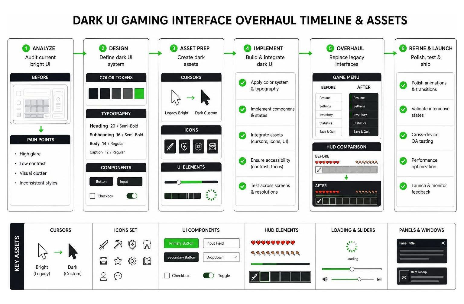
When bright, legacy white or high-glare menus are overhauled into modern dark layouts, game navigation becomes significantly more comfortable and immersive:
- Custom Dark Cursors: Swapping bright white OS pointers for low-glare dark cursors prevents unwanted eye glare and visual distraction during intense action gameplay.
- Seamless Menu Screens: Darkening sub-menus, slider tracks, inventory slots, and loading screens eliminates sudden flashes of blinding white light during fast scene transitions.
- Cluttered HUD Cleanup: Reducing heavy panel borders around action hotbars, health indicators, and minimaps allows the player to remain focused on the surrounding game world.
To upgrade your own gaming interface with sleek, low-strain HUDs, dark container slots, and minimalist inventory screens, explore our collection of custom Minecraft dark UI texture packs.
Frequently Asked Questions About Clean Dark UI
How does a Clean Dark UI differ from standard pitch-black dark mode?
Standard pitch-black dark mode relies on absolute black (#000000) backgrounds paired with high-contrast pure white text, which often causes eye strain and visual halation. A Clean Dark UI utilizes balanced charcoal or dark slate backgrounds with soft off-white text, strict whitespace grids, and selective accent colors to reduce eye fatigue and lower cognitive load.
How can developers implement dark mode toggles without performance overhead?
Developers can implement performant theme toggles by storing visual variables as CSS custom properties on the root element. Switching modes involves updating a single top-level DOM attribute (such as data-theme="dark"), avoiding heavy JavaScript layout recalibrations or dynamic style recalculations across individual components.
What design tokens are essential for an accessible dark theme?
An accessible dark theme requires a foundational token structure comprising surface colors (base, card, overlay), typography tokens (primary text, muted text), semantic state tokens (success, warning, error), and visible high-contrast focus indicator tokens that meet WCAG 2.2 AA contrast standards.
Conclusion

A Clean Dark UI is far more than a simple visual aesthetic—it is a practical approach to visual ergonomics, legibility, and distraction-free design. By steering clear of absolute pitch-black backgrounds, establishing systematic design tokens, enforcing WCAG accessibility standards, and structuring components on an 8pt layout grid, developers and designers can build dark interfaces that are as functional as they are beautiful.
Whether you are building modern web applications with libraries like DarthChowder/CleanUI and @draekien/clean-ui via NPM registry @draekien/clean-ui, or customizing your favorite gaming setup, applying clean dark mode principles guarantees a smooth, low-strain user experience.
Explore our latest resources at MCPEUDAY to discover top-tier shaders, interface overhauls, and graphics modifications tailored to elevate your gaming visuals.